Responsive design does more than enhance accessibility and usability—it directly boosts your web app's performance. By serving only the necessary content for each device, responsive design reduces data processing and download times, making your app run faster and smoother across all screen sizes.
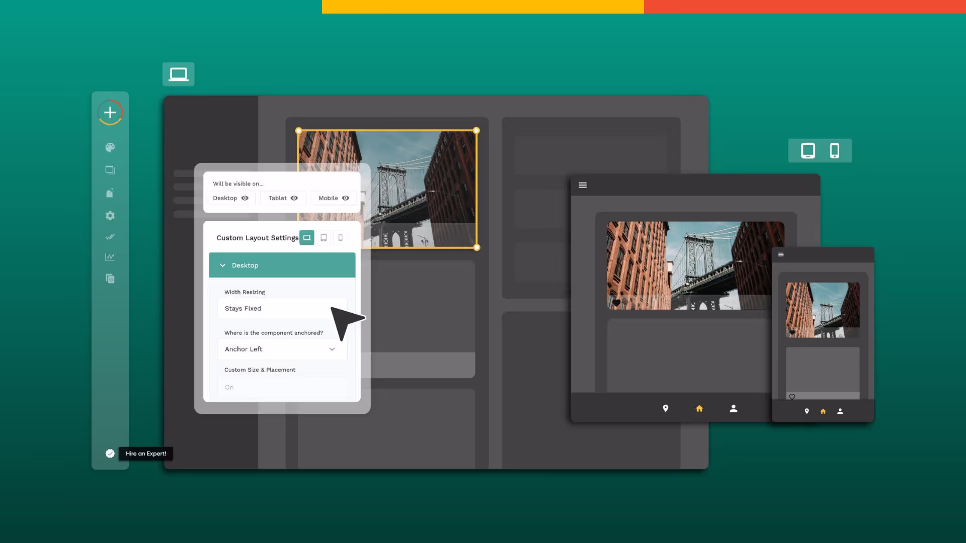
Platforms like Adalo, a no-code app builder for database-driven web apps and native iOS and Android apps—one version across all three platforms, published to the Apple App Store and Google Play, make implementing responsive design more accessible than ever. With visual development tools and built-in responsive features, creators can ensure their apps look great on any device without writing complex code. One build publishes to web, the Apple App Store, and Google Play Store—eliminating the need to maintain separate codebases for different platforms.
Responsive design also improves your web app's search engine optimization (SEO). Search engines prioritize mobile-friendly websites that display well across devices, so incorporating responsiveness into your design helps boost visibility and rank higher in search results.

What Are Some Common Terms You'll Become Familiar With When Designing With Responsive?
Designing with responsive principles introduces several technical terms that are essential to understand. Mastering these concepts will help you create designs that look great and function well on any device.
Here are the key terms you'll encounter:
Viewport
The viewport is the visible area of a website or app on a user's device. In responsive design, the viewport is critical because it determines the size and layout of displayed content. Designers must optimize the viewport for different devices to ensure content displays correctly across smartphones, tablets, and desktops.
Breakpoints
Breakpoints are specific screen sizes at which the layout of a responsive system changes. By choosing appropriate breakpoints, designers ensure their work functions well across all devices. Breakpoints are typically set using media queries, which apply different styles based on screen size or orientation.
Media Queries
Media queries are a core component of responsive design that enable designers to apply different styles based on a device's characteristics. They typically contain rules for different screen sizes using properties like "min-width" or "max-width," and can adjust layout, typography, and other design elements dynamically.
Fluid Grids
A fluid grid is a layout system that adjusts to different screen sizes and resolutions automatically. Rather than using fixed pixel values, fluid grids use percentages to ensure designs adapt smoothly to any screen. This flexibility is essential for creating truly responsive experiences.
Flexible Images
Flexible images adjust to different screen sizes and resolutions without breaking the layout. Images that are too large or too small negatively impact user experience. Designers typically use the "max-width" CSS property to ensure images scale appropriately while maintaining their aspect ratio.

What Should You Keep in Mind When Designing Responsive Websites, Apps, and Software?
Who is it for?
When designing a responsive system, consider how people will use it on different devices. Mobile users often have different priorities and goals than desktop users, and may prefer touch-based interactions. Understanding these differences helps you create a system that works well for all users regardless of their device.
What comes first?
Content prioritization determines which information is most important and ensures it's prominently displayed regardless of device. On mobile, you might display a simplified version of a page with key information, while desktop users may expect more detailed content. This hierarchy ensures users always find what they need.
When does it 'respond'?
Choosing the right breakpoints is essential for ensuring your design works flawlessly across all devices. These are the specific screen sizes where your layout changes to accommodate different viewing contexts. Strategic breakpoint selection prevents awkward layouts and ensures smooth transitions between device sizes.
What about images?
Media optimization ensures all images and other media are prepared for different screen sizes and resolutions. This might mean using multiple versions of an image or video and serving the appropriate version based on the user's device. Properly optimized media improves both performance and visual quality.
How about input?
Different devices have different input methods—touch versus mouse, for example. Designers must plan for these device-specific interactions and ensure the system works well with all input methods. Touch targets need to be larger on mobile, while hover states matter more on desktop.
How do we know it works?
Testing your design on a variety of devices is critical to ensure it works smoothly across all of them. Whether using emulators or physical devices, thorough testing reveals issues that might not be apparent during the design phase. This step is essential for delivering a polished responsive experience.

Why Mobile-First Design is Recommended Over Desktop
If you're unsure whether to start with desktop or mobile design when creating a responsive system, mobile-first is generally the recommended approach. This methodology has become increasingly popular for several compelling reasons.
It Ensures That Your System Works Well on All Devices
Mobile devices have more limitations than desktop devices—smaller screens, slower processing speeds, and variable network conditions. Starting with mobile design forces you to create a system optimized for these constraints, which naturally scales up well to larger devices. The reverse approach often leads to cramped, compromised mobile experiences.
It Prioritizes Content and Features
Limited mobile screen space requires designers to make deliberate choices about what content to display and how to present it. This constraint results in a more streamlined, focused design that includes only the most essential elements. Users benefit from this clarity regardless of which device they use.
Takes Advantage of Unique Mobile Capabilities
Touch-based interactions, location services, and camera access are just some of the features that can be optimized for mobile. Starting with mobile design encourages you to leverage these capabilities, creating experiences that feel native to the device rather than adapted from desktop.
Ada, Adalo's AI builder, lets you describe what you want and generates your app. Magic Start creates complete app foundations from a description, while Magic Add adds features through natural language.
Adalo's AI-assisted platform supports mobile-first design workflows naturally. Magic Start generates complete app foundations from simple descriptions, creating database structures, screens, and user flows that work across all device sizes. This approach lets you focus on your app's core functionality while the platform handles responsive adaptation.
When Desktop Design Makes More Sense
There are cases where starting with desktop design is appropriate. If your system is primarily used on desktop devices, or if a desktop design already exists and needs mobile adaptation, beginning with the larger format may be more practical.
However, in most cases, mobile-first remains the better approach. Once the mobile design is complete, designers can scale up to larger devices and add additional content and features as needed. The constraints of mobile design typically produce cleaner, more focused experiences that translate well to any screen size.
For teams building with Adalo, the platform's X-Ray feature identifies performance issues before they affect users, ensuring your responsive design performs well regardless of where you started. This proactive approach to optimization helps maintain speed and responsiveness across all devices.

What You Need Are Tools That Let You Build Software With Responsive Design
A responsive design tool helps you create user-friendly web apps that work seamlessly across all devices—desktops, smartphones, and tablets. With the right tools, your app will look great and function smoothly regardless of screen size.
Using a responsive design tool saves significant time and effort. These tools automate the process of adapting your app to different screen sizes, reducing manual coding and testing requirements. This leads to faster development times and increased efficiency, letting you focus on features and user experience rather than technical implementation details.
Adalo exemplifies this approach with its visual development environment. The platform has been described as "easy as PowerPoint" for visual building, while its AI capabilities promise even faster creation speeds. Magic Add lets you add features through natural language requests—describe what you want, and the platform generates the necessary components.
With over 3 million apps created on the platform, Adalo's infrastructure has been battle-tested at scale. The Adalo 3.0 update in late 2025 completely overhauled the backend, making apps 3-4x faster with modular infrastructure that scales to serve apps with millions of monthly active users. Paid plans include unlimited database records with no usage-based charges—eliminating bill shock concerns that plague other platforms.
How Adalo Compares to Other Responsive Design Tools
When evaluating tools for building responsive apps, understanding the differences between platforms helps you make an informed choice.
Bubble offers extensive customization but comes with trade-offs. Their web and mobile wrapper solution starts at $69/month with usage-based Workload Unit charges and limits on app re-publishing and database records. The mobile offering wraps the web app rather than compiling to native code, which can introduce performance challenges at scale. Extensive customization often results in slower applications that struggle under increased load, frequently requiring hired experts to optimize.
Adalo starts at $36/month with unlimited usage and app store publishing. One build publishes to web, iOS App Store, and Android Play Store with unlimited updates. The platform compiles to true native mobile code rather than wrapping a web app, maintaining performance as user bases grow.
Glide excels at spreadsheet-based apps with template-focused building that enables fast deployment. However, this approach creates generic, simplistic apps with limited creative freedom. Pricing starts at $60/month for custom domain capability, but includes limits on app updates and data records that incur additional charges. Glide does not support Apple App Store or Google Play Store publishing.
FlutterFlow targets technical users with a low-code approach. Users must set up and manage their own external database, adding significant learning complexity—especially when optimizing for scale. Pricing starts at $70/month per user for app store publishing, but this doesn't include database costs. Their builder also limits view to 2 screens at once, while Adalo can display up to 400 screens on one canvas.
Softr focuses on spreadsheet app building but requires $167/month to publish a Progressive Web App, still restricted by records per app and datasource. Softr does not support native iOS or Android app creation or app store publishing.
Note that many third-party platform ratings and comparisons predate Adalo 3.0's infrastructure overhaul in late 2025, which fundamentally changed the platform's performance characteristics and scalability.
Wrapping It Up
Responsive design is essential for ensuring your web app functions smoothly on any device. By adapting to different screen sizes and resolutions, responsive design enhances accessibility and usability while improving performance and search engine optimization.
When designing a responsive system, keep your users in mind and understand how they'll interact with different devices. Content prioritization, appropriate breakpoints, media optimization, and device-specific interactions are all crucial considerations. Thorough testing across multiple devices ensures your design works smoothly everywhere.
Whether you're designing for desktop or mobile, responsive design is fundamental to creating apps that meet user expectations. The right tools make this process significantly easier, automating adaptation while letting you focus on what makes your app valuable.
FAQ
Why choose Adalo over other app building solutions?
Adalo is an AI-powered app builder that creates true native iOS and Android apps alongside web apps. Unlike web wrappers, it compiles to native code and publishes directly to both the Apple App Store and Google Play Store from a single codebase. With unlimited database records on paid plans and no usage-based charges, you avoid the bill shock common with other platforms.
What's the fastest way to build and publish an app to the App Store?
Adalo's drag-and-drop interface and AI-assisted building let you go from idea to published app in days rather than months. Magic Start generates complete app foundations from descriptions, while the platform handles the complex App Store submission process—certificates, provisioning profiles, and store guidelines are managed for you.
Can I easily implement responsive design in my app?
Yes, Adalo's visual development tools and built-in responsive features ensure your apps look great on any device—desktop, tablet, or smartphone—without writing complex code or managing breakpoints manually. One build adapts to all screen sizes automatically.
What is mobile-first design and why is it recommended?
Mobile-first design starts with mobile devices before scaling up to larger screens. This approach is recommended because mobile devices have more constraints like smaller screens and slower processing, so designing for them first ensures your system is optimized for all devices and prioritizes the most important content.
What are breakpoints in responsive design?
Breakpoints are specific screen sizes at which the layout of a responsive system changes to accommodate different devices. They are set using media queries and allow designers to apply different styles based on screen size or orientation, ensuring the design works well across all devices.
How does responsive design affect SEO and app performance?
Responsive design significantly boosts both SEO and performance. Search engines favor mobile-friendly websites, so responsiveness helps your web app rank higher in search results. Additionally, responsive design serves only necessary content for each device, reducing data processing and download times.
Which is more affordable, Adalo or Bubble?
Adalo starts at $36/month with unlimited usage and app store publishing. Bubble's comparable offering starts at $69/month with usage-based Workload Unit charges and limits on records and app re-publishing. Adalo's pricing includes no usage-based charges, eliminating unexpected costs.
Which is better for mobile apps, Adalo or Glide?
Adalo creates true native iOS and Android apps that publish directly to app stores. Glide does not support Apple App Store or Google Play Store publishing at all. If app store distribution is important, Adalo is the clear choice.
Do I need coding experience to build responsive apps?
No coding experience is required with Adalo. The platform's visual builder has been described as "easy as PowerPoint," and AI features like Magic Start and Magic Add let you build by describing what you want in natural language.
How much does it cost to build a responsive app with Adalo?
Adalo's paid plans start at $36/month with unlimited database records and no usage-based charges. This includes publishing to web, iOS App Store, and Android Play Store from a single codebase with unlimited updates to published apps.
Build your app fast with one of our pre-made app templates
Begin Building with no codeRelated Content
How to Optimize UI for Mobile, Tablet, and Desktop
Practical steps to build responsive UIs: mobile-first design, fluid grids, breakpoints, responsive media, and device testing.

Best mobile app design software
Choose a cloud-based, cross-platform design tool for team collaboration or a native desktop app for offline speed—pick by workflow, not hype
How to Ensure UI/UX Consistency Across Platforms
Create a single-source design system with design tokens, responsive and adaptive layouts, and real-device testing to keep UI/UX consistent a

Offline Maps and Geolocation: Integration Guide
Combine offline map downloads with device geolocation for reliable mobile navigation, reduced data use, efficient storage, and stronger user